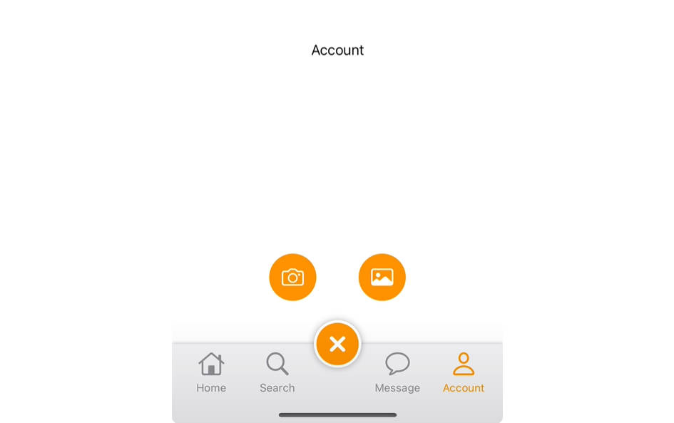
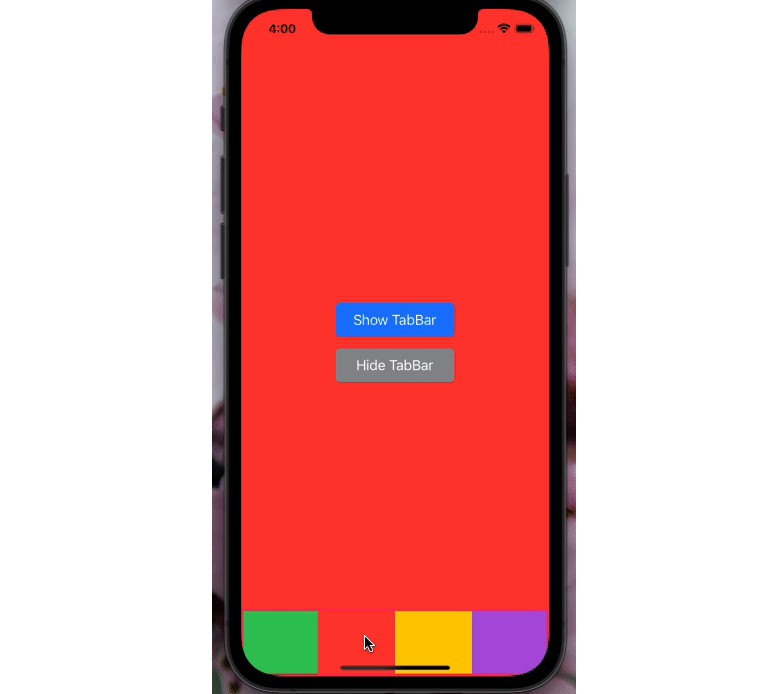
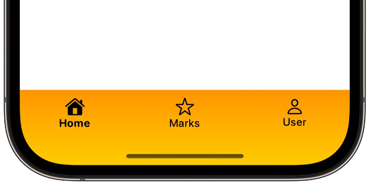
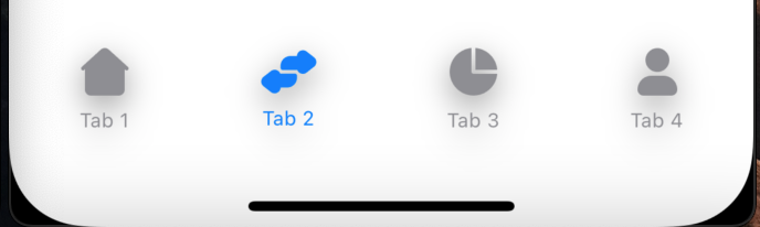
具有不同样式选项的可自定义标签栏
易自定义标签栏


例
若要运行示例项目,请克隆存储库,然后首先从示例目录运行。pod install
要求
- iOS 14.0 或更高版本
- 迅捷用户界面
安装
EasyCustomTabBar可通过CocoaPods获得。要安装 它,只需将以下行添加到您的 Podfile 中:
pod 'EasyCustomTabBar'
Usage
You can find Demo App from the git repository in Example directory.
To create custom tabbar with simple code follow the mentioned steps; Make sure to add EasyPin in Podfile & install it
Step 1
import EasyCustomTabBar in your code file
import EasyCustomTabBar
Step 2
Initialize array which will represent you tabbar items
let items: [TabItem] = [
TabItem(title: "Tab 1", image: Image("tab1")),
TabItem(title: "Tab 2", image: Image("tab2")),
TabItem(title: "Tab 3", image: Image("tab3")),
TabItem(title: "Tab 4", image: Image("tab4"))]
Step 3
Initialize a State variable to keep track of active tabbar item’s index
@State var selectedTabIndex = 0
Step 4
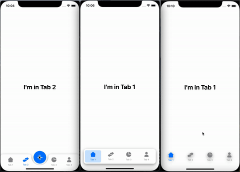
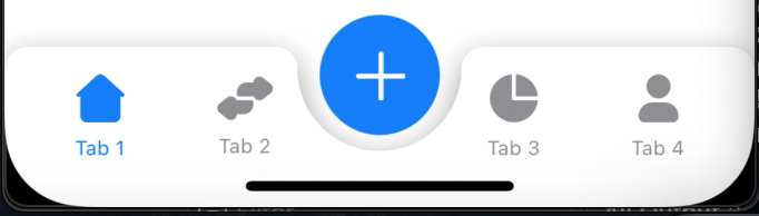
Choose the tabBarStyle according to your requirement. This will set the actual view of the tabbar. Available options are: simple, separate, centeredButton
- Centred Button
- Separate
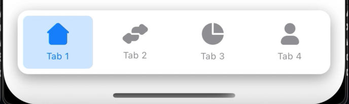
- Simple
Step 5 (In case of Centred Button Tabbar Style)
If you want centred button tabbar style then initialize boolean State variable otherwise you can skip this step
@State var centreBtnPressed: Bool? = false
Step 6
In your body add a ZStack with following properties:
ZStack {
    // Here next code will be implemented
}.frame(alignment: .bottom)
Step 7
Now you can simply create your tabbar with following code.
- tabs: Array of tabbar items
- selection: Index of active tabbar item
- tabBarStyle: You can choose between simple, separate, centeredButton
- Please make sure that your index don’t exceed your array of tabbar items
ZStack {
        EasyCustomTabBar(tabs: items, selection: $selectedTabIndex, tabBarStyle: .centeredButton) {
        Tab1()
            .frame(maxWidth: .infinity, maxHeight: .infinity)
            .tabBarItem(tab: items[0], tabIndex: 0, selection: $selectedTabIndex)

        Tab2()
            .frame(maxWidth: .infinity, maxHeight: .infinity)
            .tabBarItem(tab: items[1], tabIndex: 1, selection: $selectedTabIndex)

        Tab3()
            .frame(maxWidth: .infinity, maxHeight: .infinity)
            .tabBarItem(tab: items[2], tabIndex: 2, selection: $selectedTabIndex)

        Tab4()
            .frame(maxWidth: .infinity, maxHeight: .infinity)
            .tabBarItem(tab: items[3], tabIndex: 3, selection: $selectedTabIndex)

        // [Optional] In case of centred button tabbar style write the below code
        if centreBtnPressed == true {
            CentreButtonView()
        }
    }
    // [Optional] In case of centred button tabbar style write this
    .centreBtnPressed($centreBtnPressed)
    .centreBtn(TabItem(title: "", image: Image("ImageName")))

}.frame(alignment: .bottom)
Here Tab1(), Tab2(), Tab3(), Tab4() are the views which you want to open on tab selection. You can create them separately. In case of centre button action add the optional code provided in above code
Step 8 (Customization)
You can highly customize the tabbars with some properties. Here are some properties which you can add on your EasyCustomTabBar block
For Tabbar Customization:
- tabBarShadow
- tabBarCornerRadius
- tabBarColor
- tabBarHeight
For Tabbar Item Customization:
- tabItemFont
- tabItemActiveColor
- tabItemInActiveColor
- tabItemBgColor
For Centre Button Customization:
- centreBtn
- centreBtnRadius
- centreBtnPadding
- centreBtnOffsetY
- centreBtnHeightWidth
- centreBtnBgColor
- centreBtnTextColor
Author
Fahad Shafiq, fahadshafiq48@gmail.com
License
EasyCustomTabBar is available under the MIT license. See the LICENSE file for more info.