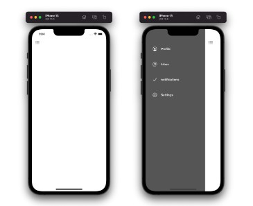
使用SwiftUI轻松创建的可自定义菜单
迅捷用户界面菜单

使用支持 SF 符号的 SwiftUI 轻松自定义的菜单
用法
-
拖放菜单.swift到您的项目中
-
在主视图中创建@State变量
@State var isMenuShown: Bool = false
-
在你的主ZStack中,添加以下代码
if isMenuShown {
    Menu(isMenuShown: $isMenuShown, menuItems: self.getMenuItems())
}
-
将以下参数集添加到主视图中,该视图位于主 ZStack 中
.cornerRadius(isMenuShown ? 20 : 0)
.offset(x: isMenuShown ? 300 : 0, y: isMenuShown ? 50 : 0)
.navigationTitle("Home")
.navigationBarTitleDisplayMode(.inline)
.ignoresSafeArea()
.scaleEffect(isMenuShown ? 0.9 : 1)
.navigationBarHidden(isMenuShown ? true : false)
.shadow(color: Color(red: 0, green: 0, blue: 0, opacity: 0.5), radius: 10, x: -10, y: 10)
.toolbar{
    ToolbarItem(placement: .navigationBarLeading) {
        Button{
            toggleMenu()
        } label: {
        Image(systemName: "filemenu.and.selection")
            .foregroundColor(.black)
            .font(.system(size: 18))
                }
            }
        }
        .onTapGesture {
            if isMenuShown {
                toggleMenu()
            }
        }
-
将属性添加到主 ZStack
.onAppear {
    isMenuShown = false
}
-
Add the below func in your SwiftUI file
func toggleMenu() {
    withAnimation(.spring()) {
        self.isMenuShown.toggle()
    }
}
-
Create an array of ‘MenuItem’ which we passed on to the Menu class in step 3
func getMenuItems() -> [MenuItem] {

    let array = [
        MenuItem(text: "Home", textColor: .white, sfIconName: "house.circle", sfIconForgroundColor: .white, didTap: {
            self.toggleMenu()
        }),
        MenuItem(text: "Profile", textColor: .white, sfIconName: "person.crop.circle", sfIconForgroundColor: .white, destinationObject: AnyView(Profile())),
        MenuItem(text: "Logout", textColor: .white, sfIconName: "rectangle.portrait.and.arrow.right", sfIconForgroundColor: .white, didTap: {
            self.toggleMenu()
            self.logout()
        })
    ]

    return array
}
With the above steps you will be able to add the SwiftyUI Menu to your application.
UI Customization options
-
Text customization
- By making use of , & property, you will be able to customize the menu item text
texttextColortextFont
- By making use of , & property, you will be able to customize the menu item text
-
Icon customization
- Menu item with icon image
- With custom icon image
- You can set your own custom image and manage its width and height and backgroundColor by using , , & properties
iconImageNameiconImageWidthiconImageHeighticonImageBackgroundColor
- You can set your own custom image and manage its width and height and backgroundColor by using , , & properties
- With SF Symbols
- You can make use of , , & properties to manage your icons
sfIconNamesfIconForgroundColorsfIconBackgroundColorsfIconSize
- You can make use of , , & properties to manage your icons
- With custom icon image
- Menu item without icon image
- You can set to remove image from the menu item
noIconRequired: true
- You can set to remove image from the menu item
- Menu item with icon image
Event control customization options
-
Navigating to different view
- You can pass on the view instance to . Make sure to cast your view to type before assigning the object.
destinationObjectAnyView
- You can pass on the view instance to . Make sure to cast your view to type before assigning the object.
-
Get tap event
- You can pass a closure to property to get the tap event on a menu item.
didTap
- You can pass a closure to property to get the tap event on a menu item.
Example
-
Example to shows the usage of closure
didTap:MenuItem(text: "Home", textColor: .white, sfIconName: "house.circle", sfIconForgroundColor: .white, didTap: { self.toggleMenu() })
-
Example to shows the usage of property
destinationObject:MenuItem(text: "Profile", textColor: .white, sfIconName: "person.crop.circle", sfIconForgroundColor: .white, destinationObject: AnyView(Profile()))
-
Example to show the menu item with no events
MenuItem(text: "No event menu item", textColor: .white, iconImageName: "apple", iconImageWidth: 40.0, iconImageHeight: 40.0)
-
Example to show menu item without an image
MenuItem(text: "Menu item with no icon", textColor: .white, noIconRequired: true, destinationObject: AnyView(Settings()))
Installation – Manually
Drop Menu.swift into your project.