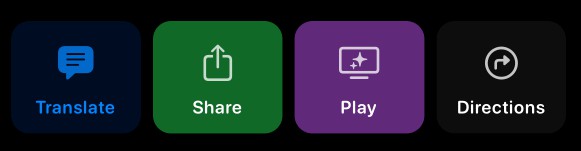
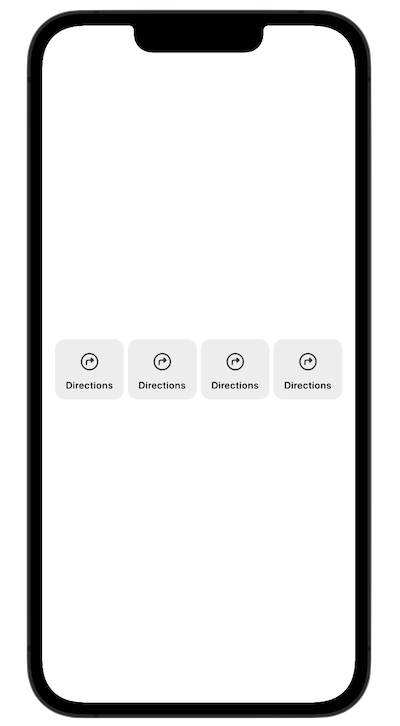
一个简单的按钮,以SFSymbol(图标)作为标签,垂直
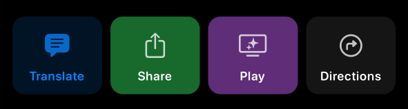
LabelButtonKit 是一个迷你库,用于标记按钮(SF 符号),完全用 SwiftUI 编写。使用LabelButtonKit,您将能够轻松创建完全可自定义的按钮,这些按钮默认带有垂直标签。但这还不是全部。LabelButtonKit 完全支持动态类型,并随着动态类型选择的增加而转换按钮。一切都会适应,并正确显示给您的用户。
✨ 特征
- LabelButtonView:此框架的主视图。只需调用它,传递一个 LabelButton(您的模型),一切都像魅力一样工作。
- 快速简单:您可以完全自定义或仅传递SF符号字符串(图标),文本和背景颜色。提供所有默认实现。
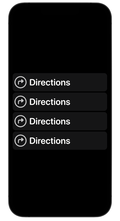
- 标签按钮列表视图。想要以列表的形式拥有它吗?我们有你。只需传递一个标签按钮数组,我们就会为您即时创建它们。完全适应辅助功能/动态类型的任何情况。
- Extra View Goodies. This package also comes with some modifiers, components and views that you can freely use.
- Built Swifty and with lightweight in mind.
- 100% Swift.
- Three simple examples are included in the package. All leveraging SwiftUI’s power.
- Documented and tested (views were tested with ViewInspector).
- Some aspects of customization include: Icon (SF Symbol string), Text, Text Color, Icon Color, Button Background Color, Color Opacity, Corner Radius, Vertical Padding, Horizontal Padding, Custom Frame and Actions.
🚀 Get Started
Using LabelButtonKit in Production Code
Just import LabelButtonKit:
import LabelButtonKit
Then, you can use it as you please. Like this quick example:
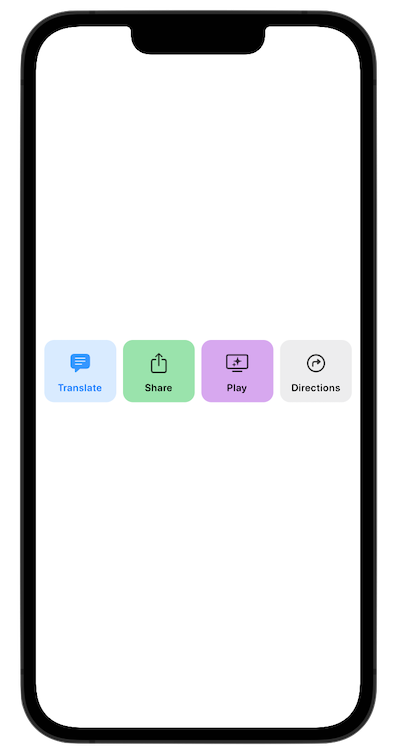
@StateObject var labelButtonModel = LabelButton(icon: "text.bubble.fill", text: "Translate", textColor: .accentColor, iconColor: .accentColor, backgroundColor: .accentColor.opacity(0.15))

var body: some View {
    LabelButtonView(label: labelButtonModel)
}
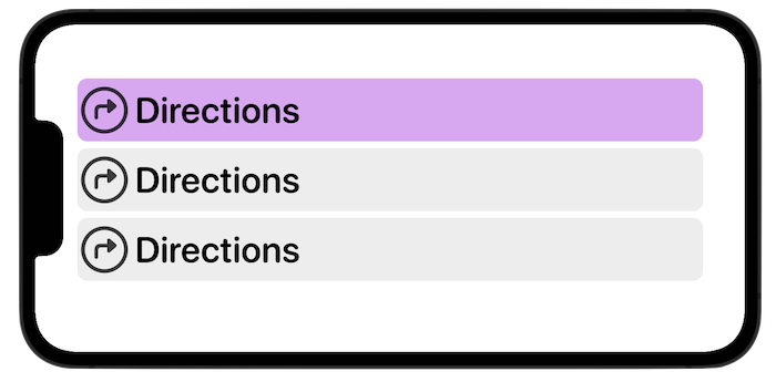
An example using the LabelButtonListView. This is one option:
struct SimpleListExampleView: View {

    @State var labelButtons: [LabelButton] = [LabelButton(backgroundColor: .purple.opacity(0.50)), LabelButton(), LabelButton()]

    var body: some View {
        LabelButtonListView(data: labelButtons)
            .padding()
    }

}
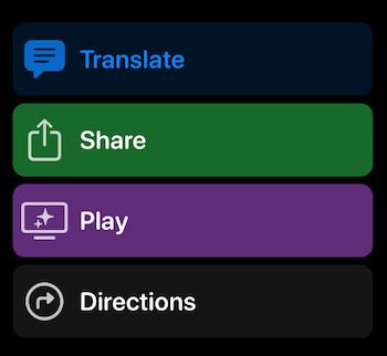
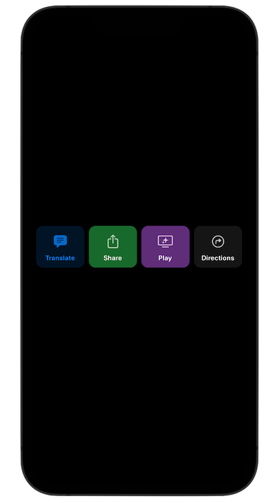
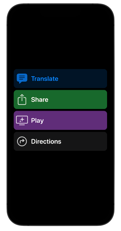
Or, you can also use it making your own stacks and verifying the dynamicTypeSize (no need for the LabelButtonView as it already does):
struct HorizontalStackExampleView: View {

    /// This example uses the sizeCategory (dynamicTypeSize) just to show that it can be used outside the LabelButtonListView. LabelButtons already adjust accordingly.
    @Environment(\.dynamicTypeSize) var sizeCategory

    var needsLargerContent: Bool {
        sizeCategory >= .xxLarge
    }

    var body: some View {

        if needsLargerContent {
            VStack(spacing: 5) {
                LabelButtonView(label: LabelButton())
                LabelButtonView(label: LabelButton())
                LabelButtonView(label: LabelButton())
                LabelButtonView(label: LabelButton())
            }
        } else {
            HStack(spacing: 5) {
                LabelButtonView(label: LabelButton())
                LabelButtonView(label: LabelButton())
                LabelButtonView(label: LabelButton())
                LabelButtonView(label: LabelButton())
            }
            .padding()
        }

    }
}
This package also includes several SwiftUI views that display the types, color and symbols in a stylish way. As well as grids and stacks. You can use these views as you please. Explore ’em all!
📱 Example App for educational purposes
LabelButtonKit also comes with several scenes that you can learn from for how to use types. Such as these and many others:
All examples are located on the Examples folder.
🔨 Swift Package Manager
You can also add this library using Swift Package Manager.
- Go to File > Add Packages.
- The Add Package dialog will appear, by default with Apple packages.
- In the upper right hand corner, paste https://github.com/MarcosAtMorais/LabelButtonKit into the search bar.
- Hit Return to kick off the search.
- Click Add Package.
- You’re all set! Just import LabelButtonKit whenever and wherever you want to use it.
🌟 Requirements
iOS 15+
macOS 12+
watchOS 7+
tvOS 14+